Sunday, June 24, 2012

Evaluation of the Graphical User Interface


During this project I was tasked with creating an interactive graphical user interface. This user interface would respond to hotkeys, mouse clicks, and various other interface elements to help breath it into life.

During project development, I stuck with my intial plan, which was to develop the UI in C++, using SDL as the graphics library in order to blit my images to the screen. The end product, was close to my original intentions, if not a little lazy in the areas that I wanted to implement, but time constraints, and knowledge of the API meant I didn't have much to work with intially to meet the final deadline.

In the end, the final product was capable of responding to hotkeys and showing the appropriate screen to correspond with that. Furthermore, it changed the internal state of the object to display a glow around the images and remove the screen and the same key was pressed twice, or another screen popped up.

Did your end product match your original intentions?

The end product matched somewhat to my original intentions, and this post will relay all the aspects that I hit while developing this piece.

One key factor was the lack of a mouse over option. Due to the nature of SDL and the blitting of pixels, I found it rather difficult and time consuming to render a RECT around the image and apply a mouse over event to detect. While I could have done it with no doubt in my mind, I intially knew that I had to cut the most time consumin aspects out, in order to develop this by the deadline.

Another factor was the lack of the health bar and the compass. I felt to relay my end prodcut to focus on the main objective was enough, implementing more images (causing more overhead) would have been an intial waste of resources, in itself, there, I decided that  focusing my UI on the main elements was beneficial enough and allowed me to put more work in that area, rather than others.

How did you manage your time?

Time was a key factor in this development process, we had three weeks to plan and produce. That wasn't enough time to get things completed the way I intended, instead, I took alot of time aside to work on the graphical aspects of it, the books, maps, bags. Getting this out of the way first, during the planning stage, allowed me to focus on the coding side of it all, and reduce the stress to allow me to architect a solid system.

My time was planned intially to spend the half term week holiday at my own computer with all my own tools to develop this, which gave me two weeks at college previously to plan, create and work on the graphics aspects of the UI.

How could you manage your time more effectively?  


I honestly can't think of how I could effectively have made better use of my time, I planned from the start how I would use it, and I stuck to it. I could have given myself an extra week, to work on implementing other features into the UI, but the extra work would have taken focus away from my other studies. Intially, I do believe the the time I spent on this was spent correctly and effectively with little impact on the end product, minus the extra week I could have used.

What problems did you face?


One problem I faced was utilising the SDL API. While the API itself is farely easy, it lacks some graphical aspects that I would have really enjoyed, however, I didnt intially attempt to program this in OpenGL, but looking at the time it would take to even render a simple image on screen, I knew I had to look elsewhere.

Another problem I faced was getting the mouse over to work, while I got close, I find the reponse of the event system implemented to lax, and I couldn't grip the correct RECT location to intiate a response. After two days of working I decided that I would abadon this to approach at another time.

What did you find easy?

I found actually implementing the subsystems and working on the correct architecture was the best part and most easiest to control for me. Coupled with the development of graphics in photoshop, I found it easy to implement the UI, the main problem stemmed from various areas that where intially out of my direct control.

Thursday, June 21, 2012

How to Build a PC


Welcome, to a rather unusual blog post. This one all about building a PC. Now, I don't mean taking a PC and literally making the Silicon parts, and creating the individual chips, that'd be stupid.. like the time I attempted to do it.. and failed... poorly.

First off, lets begin by talking a little about the components and then how they slot into the system and how they operate. A little history about me however, I have been building computer systems since I was 15 and got my first computer, since then I have upgraded, renewed, rebooted and done a wide range of tasks, so lets begin.

CPU 

The CPU is the main component, it's task is to process information, (Bits) and send data and messages to other components of the computer. Imagine that the CPU is the brain, it has the job of commanding and working with the computer and processing everything to ensure it all works.

GPU

The Graphics Processing Unit, is the component that handles processing Vertex Data, Pixels and Buffers, and then displaying these to the Display Unit (Monitor), while its job can be done by the CPU, it is much more efficient to offload that pressure and place it on the GPU instead. There is even PPUs (Physics Processing Unit), but thats not quite offcial yet.

RAM

Random Access Memory, is a collection of physical memory components that are split into 9 Bits per Byte, the 9th used for storying memory parity errors. RAM is used by programs to store data like variables and levels, as well as other program data. The entire program is loaded into memory and more memory is allocated at Run Time if required.

PSU 

The Power Supply Unit is the part of the computer that generates and distributes electricity to the system, so it can be powered. They come in various watts, 400W, 450W, 500W. For a average systemm a 450W is more than suffcient, however, count up the componentry power units, in order to get an idea on how much power you need. 

Motherboard

The motherboard is probably the most important part of your system. It acts as the main boss of the entire computer, accepting components through slots called BUS and distributing data between componenets along canals and couplings. Without the motherboard, the components would not be able to operate together, and therefore, remain useless.

Disk Drive

Disk Drives come in various sizes and quantities, but the intial concept remains the same, they slot into your computer case, and connect to he motherboard using wires called SATA and a power supply through Molar cables.

Harddrive 

Another very important part, Harddrive come in various capacities and types, IDE, SATA, SSD, they all perform the same function though, and thats to store data in a magnectic disk (or in the case of SSD, store data to a flash drive).

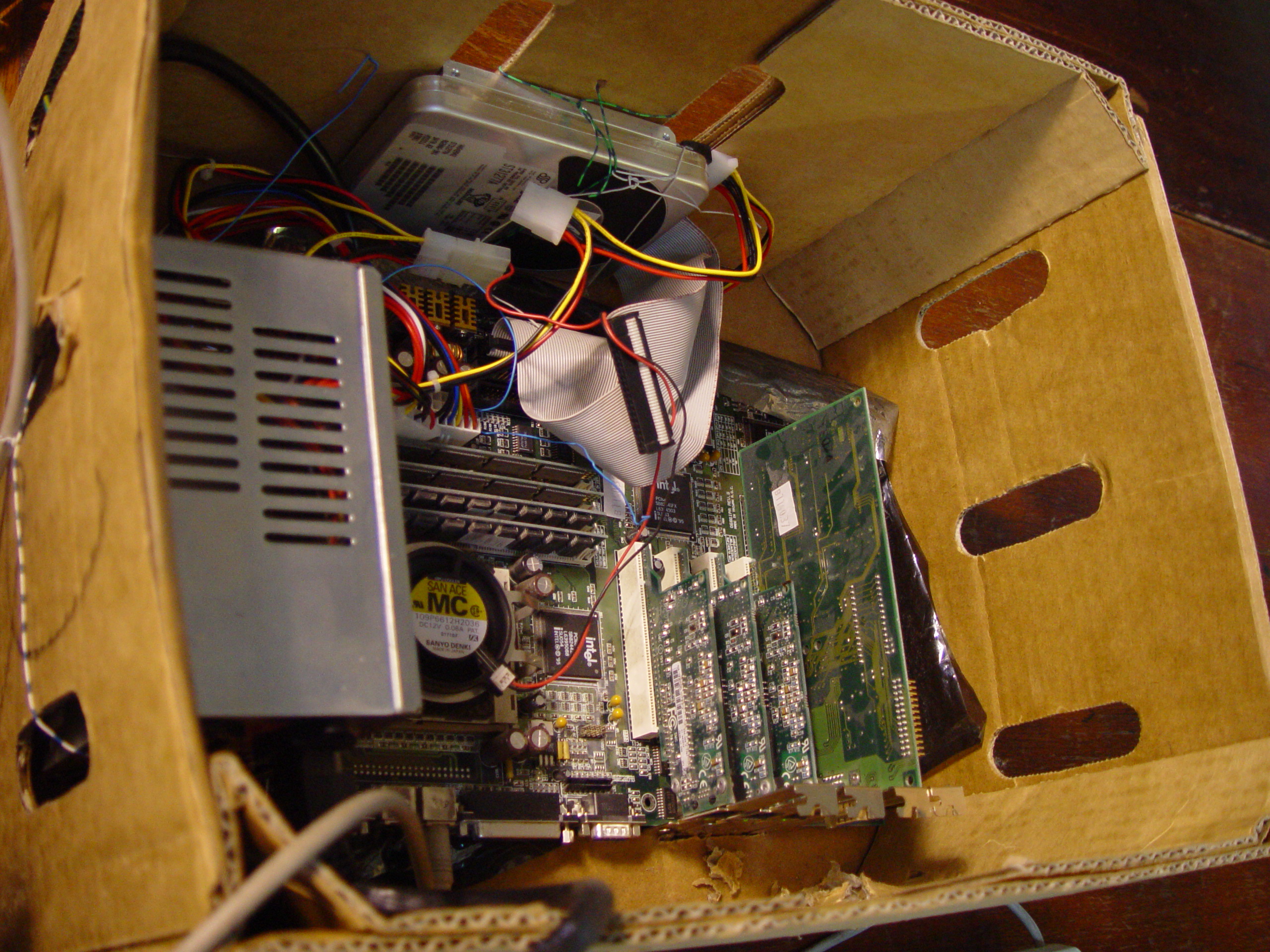
Building the PC - Internals

The first thing you need to know about building the internals of a PC is that everything is of a volatile nature. You should take precautions to remove static from your hands, as this can cause serious damage to the actual internals of a components. Using a static clamp, or simply running your hands across the metal structure of the case is suffice enough to ensure no static conducts your internals.

The next  thing is to get your case, providing you have one. A case is just a metallic box, which comes in various sizes, standard is the ATX Case, which supports a wide range of motherboards and disk drives.  Standard case looks like the following below.


Taking your case, you need to layer it down flat, and remove the side. Usuing this is the left side of the base, when facing forward, but you'll know, its the section that doesn't have the huge metal dinner plate sitting on it.

Working with the motherboard

I hope you have a screwdriver handy, cos the next section requires. Never say that we computer geeks don't know how to work tools. You need to take your motherboard, and carefully place it flat against the backface of the case. This is called, mounting the motherboard.


This is an essential step, so make sure that your motherboard is tightly bolted down, you really don't want this to fall out when you prop your case up, so best to check by slowly lifting your case from the top and see if the motherboard stays still. If your motherboard is too small or too big for your case, then you have clearly got the incorrect size for your system, and its time to go back to the shop.. or use a cardboard case.


Once your motherboard is correctly bolted in, move onto the next section, inserting the CPU. Pay attention to this part, because if you get this wrong, it could go bad for you.

Inserting the CPU

The CPU is the brain of the system and processes everything from the smallest bit to the gigabyte data files. Without a CPU, your computer will not run, will not sing and will not fight. So it's important you get this right. You CPU should have come in the following parts, below is a AMD FX 6100 (Codenamed "Bulldozer" if your interested)

Your CPU should look something similar, underneath with long metal pins. We very careful not to bed these, otherwise you'll have a joyous time trying to insert this into the slot. Now, liste up, because this is very important. They are different types of sockets for inserting CPUS. I'll talk about AMD, because i'm not too familar with Intel. But Before that, you should know that motherboards are optimised (or rather designed) for specific CPU brands. AMD motherboards use the AM2, AM2+ and the AM3 sockets, and support a wide variety of other extra buses, while the Intel have there equalivent that supports there CPU brand.

It's always a good idea to do your research, or use Computer Planet, it has a great PC designer, that is brilliant for building a PC without worrying about compatibility (It handles this for you).

So, you have your AMD CPU (or intel, but i'll reference AMD, you can switch it across easy enough). The slot you are looking for is marked on the diagram below.


You will notice that both the chip and the slot lack a small area of the pins, this defines what way you need to insert the chip, so carefully taking two hands, gently and slowly insert the CPU into the chip slot, if it doesn't seem to want to go in, DO NOT force it, instead, take your time to carefully check why it isn't insertinh, it could be you haven'ts aligned the pins correctly, or that you are trying to insert a incompatible CPU for your motherboard.

But once you have it in, then its time to move onto the next part of this section, applying the thermal paste.

Thermal paste is used to help keep the CPU cool. A CPU can generate enough heat to burn the skin off your hand in a few miliseconds, so its vital we do our best to keep it cool and from setting on fire. The idea of the thermal paste is to act as conductor of heat, for the heatsink to help pass that away. A digram below will show what I mean. (TIM means Thermal Interface Materials, generally just Thermal Paste).


The main role of the heatsink is to take the heat generated by the CPU and dissipate that into the surrounding air. The reason we need Thermal Paste is to conduct heat, the problem is, the little air pockets that might arrise between the CPU and the heatsink is very bad, and a build up of air (which is not conductive of heat by the way), can cause more overheat and therefore blow the CPU its self. (Which is bad). The Thermal paste acts as that filler, rather to help conduct the heat, so its vital this is done correctly.

There are three types of Thermal Pastes, your have you Metal Based Pastes, which are probably the most expensive but more effcient. The grease contains lots of little metal particles which conduct heat very well, and therefore allow for a cooler CPU overall.

The second is a Ceramic Paste, this doesn't perform as well as the Metal Based Pastes, however its cheaper, and isn't that much different from the Metal Based pastes, also, the ceramic particles do not conduct electricity, so therefore, in my opnion is also a safer option, and a faster one for your CPU.

The last one is Silicon Based. These are pretty much thermal pads, that you slap onto the top of your CPU, and are easily removed afterwards, but don't provide near enough conduction as the previous two, and if you have a powerful computer system (6 Cores :D) then your not going to get far with these.

This is a little long winded, so lets begin applying that grease. First thing you should know is something called Lapping. This is a technique to smoothen out the surface of the CPU, to allow for less TIM and more conduction. I won't go to far into this, as its a topic all on its own, however, feel free to check it out in your own time, for now, your CPU should be fine, and unless you plan to stick into another motherboard, there is no reason worrying too much about that.

You only need to put as much thermal paste on as there is to fill the air pockets between the Heatsink and the CPU, so a thin layer is needed only (If you are replacing a CPU then Lap the CPU Surface first, otherwise you'll likely need more Paste to make up for the increased air pockets). Then put a little dab of paste, no larger than a grain of rice, and spread it out, in a thin layer. You don't need a whole lot remember, just a small amount. Once that is done, fix on your heatsink, and then attach your fan. Follown your, manufacturers instructions for installing CPU fans, each one is different.
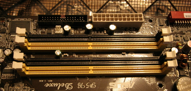
Inserting the RAM

RAM is used to store volatile data about a program, while running. It is a run time concept, meaning, the memory only stays in memory while the computer is running, once that is switched off, then you lose all the data stored. RAM is generally pretty easy to install.

Located on your motherboard, you should see some BUS slots that look like the following:


Typically, one RAM slot, holds one stick of RAM. For your reference a stick of RAM looks like the image below.

RAM like Harddrives can come in various sizes, 1GB, 2GB, 4GB, 8GB. And can be coupled up with more than one piece of RAM to increase available storage.

As I previously stated, RAM is generally simple to install. With your two forefingers, grab the top coerners of the RAM stick, and please it gently against the slot. Make sure you have it facing the right way and that the small incision in the chip match against the BUS. Then, with a quick push it should slot in pretty nicely. Clamp it down with the white clamps at either side of the slot, and there you go. RAM is installed. Pretty simple right?

Installing the Harddrive

Harddrives are generally one of those "WTH" moments with some people. But fear not, I'll help you figure this out. To install your harddrive, you must first choose a slot in the tower. All Tower cases come with a predefinied number of metal slots, these are for storying harddrives, evidently and also disk drives.

General, the first thing you do is clamp your drive in. This is pretty simple task, you slow it into a spare disk slot, and screw it down.


Once achieved, you need to take your SATA/IDE cable. Now, a little word of advice. Modern day systems use Sata as the method of data transfer, as such IDE Harddrives are pretty much deprecated by todays standard. In fact if you can find anyone who sells an IDE HDD still, then you probably want to look elsewhere. While they are cheaper, the data is transferred at around 3/4 of the speed of a SATA. But the call is yours to make. Also, the cables for IDE is clunkly and gets in the way. The difference between cables, is shown in the image below.


So taking your selected cable and plug it into the back of the harddrive. With IDE harddrives its simple to see where to plug it in, and the small stopper at the top, assures you can only put it in, one way. As for the Sata, look for a slot with a L shape section cut out, and then, match the slot of the cable to that point and you simply just click it in.

Now comes the careful. In order for data to be trasnferred to the motherboard and and data/messages be sent back, you must hook the other end of the cable into the motherboard. They should be a slot nearby, thats matches the same look as on the device. Simply, plug it in, and you're set.

Finally, takign your power cable, and plug that into the back of the harddrive, and boom, your done. Not as hard as you assumed right? Well, the next part once your system is booted up, comes to formatting the harddriveso it can be used to write data too. But i'll leave that as a task for the reader to achieve.

Tuesday, May 29, 2012

3D Environment Reflection

Environment Overview
And finally, I discuss about the environment I developed. This post is a general reflection on that environment and should work to give a detailed insight into the development progress of the Salts Building.
This was the main theme of the project we set out to develop, and my environment was at the forefront of this creation. Initially I decided that I would create a photorealistic replica of the Salts Building Exterior, however, in realising time constraints, the volatile nature of 3DS Max, and also the skills I possessed, I felt it would best if I developed a more simplistic but appreciative concept style. I took inspirtation from the image of the Salts Building I took previously in the year, and also on the dynamic nature of the environment, trying to picture a more worn down, and lucid Salts Building, I realised images from fantasy games like Dragon Age, and Witcher 2 helped me to generate a good idea of the concept I was intially planning on.
Dragon Age - Ruins of Ostagar
http://greywardens.com/wp-content/uploads/2010/08/Ostagar.jpg

I knew, during the concept phase of the environment I had to use all my resources to generate a feasible solution, I knew the software I had to use, Photshop coupled with 3DS Max for the environment development, but simply getting an idea of what I wanted was key to the successful development of this environment.

I started by producing sketches and concept designs, collecting images and collating them together to get a good theme and standing for the end product I wanted to develop. Below are some concept designs I created for the 3D Environment itself.
The question, how did I  do this,  is a viable question to ask, I generated the foundation of the environment through box modelling techniques, to create the base theme and setting, this allowed me to construct around it and add on the extra detail with minimal effort. I chose box modelling techniques over other conventional methods simply because I believe through experience that for constructing buildings, box modelling serves a better purpose in the long run. Plus it is simple, quick, efficient and easy to get started.

Lets also take a look at the Salts Building Image, coupled with some development images from the production to get a good on the technnique used and how it compared to the final product.


Above is the actual Salts Building, below is my rendered environment, looks alike right ? Okay maybe not, but  you get the picture.


How did we manage our time ?

During the development process we created a production plan, which detailed the amount of time, and the hours during the week we could realistically spend on the environment itself. In the project plan I detailed various times when I'd work on texturing in photoshop to apply to the environment, this came in handy on Thursdays, which we didn't have intial access to the production suite with 3DS Max installed.

The main advantage to this is it allowed us to manage our time effectively, we knew when we needed to generate textures and allowed us to allocate specific hours, and gave us an absolute insight into what was going on and what I specifically, needed to drop in order to assure we met the end deadline.

I do believe personally, that more could have been done for the environment, if I had managed my time, and my teams time more effectively, this could have been done by outlaying what had to be done by week, and also keep a to-do-list or changelog that helped define what was done, changed and needed to be done still, with this, I could have accurately spread out the development and still managed to develop a more robust environment.

What problems did you face ? 


We faced a wide range of issues, ranging from time constraints to general crashes of the software. One big issue that affected everyone was the volatile state of 3DS Max. Luckily the software came with a backup system, to ensure that we did not lose too much work, which helped to eliviate some of the stress from production.

Another problem we faced was man hours approachable on the environment, we had roughly 3 Hours on and Monday and 5 hours on a Tuesday to work on our environment, thats 8 hours a week, for a 6 week period, overall thats 48 Hours in total, about 2 days worth of work to get this done. Not a lot of time if you consider, give and take the hours we actually did at home, mind you.

Another problem was my texturing skills. Texturing was one of those small detail aspects that was difficult to work with, and required alot of work to create a repeatable background for the intial design.

What did you find easy?

I found that lighting and modifying the intensity, volumetrics and placing on bump maps that reflect the normals, was a very easy part for me. I also found that using the lighting to create a design and compliment the environment effects and ambience was great addition to the overall look and feel of the final production piece.

 Did you learn anything new while working on this project ?

To say I learnt nothing would be a lie. I have learnt not only skills in 3D Modelling software, but an appreciation for the work that goes into it as well. I have learnt about lighting techniques that I have been able to apply over to my programming realm, learnt more about 3D Geometry, Normals, Vertices and Polygons, all couple with the basis of bringing together a dyanmic environment, and the knowlegde attained is something I can take with me through life in my future careers.

How does your finished product compare to a professional example?

If we compare my final product to one of a professional concept, we can clearly depict the differences.

Tuesday, May 22, 2012

Sound Reflection

During the audio production I developed and produced a production piece for my trailer, for this I used the talents from my brother's guitar playing, due to my lack of musical ability.

I created the audio and edited it in Cubase to improve the effectiveness and sharpness, the music was directed from me to my brother, and played through into the actual sound card. This allowed me to directly record the sound into Cubase and model to my whim.

The final audio production did meet my expectations, my brother relayed the information from my descriptions and played it exactly as I imagined it. However there were points where the spikes hit in the guitar playing, which caused stuttering or rather caused it to generate a distortion, which I was unable to rub out and cut down using the editor, however, during the final production piece I was able to work with the sound in premier along with Joey to help smooth out the peaks of distortion.

I used every session in the sound room to work on my sound piece up until the showcase, I wanted to get it looking ship shape and although I lack the nessary skills with music production (and i'll be honest if I never touch a sound card again, it'll be too soon) I did like the final production, and it was used as the backing trailer for the trailer. I could have managed my time more effectively by installing cubase at home and perhaps doing more editing work there, this would have helped to bump my production grade from a pass to a merit, if i'd have given it that much more attention.

To be fair, I didn't find much of it easy, sound isn't my thing, and not something I will explore, however, I did find the intial concept of planning the song the easiest thing to produce, because of this, I was easily able to get the effect I required to generate this piece.

>>>>>>>>>>>>>>>>>>>>>>>>>>>>>>>>>>>>>>> O <<<<<<<<<<<<<<<<<<<<<<<<<<<<<<<<

Other people enjoyed the effect of the audio and the level of tension it built, however, it was too quiet to be actually heard fully, and this  played with the rest of the audio, wasn't syncronised well. However, overall, the audio alone was liked, and compared to the likes of Diablo, which was the theme that inspired my own.

My general music production capabilites, I never took to Cubase, or operating the sound card, and perhaps if I had spent a little time aside I could have found a new fondness for music. However, overall, the general skills with the producton piece.

I would try to play the guitar myself next time, and take a couple of weeks to learn some simple chords and strings, to help improve my understanding. Coupled with this, learning a new skill would be invaluable in the future.

Overall the journey has been eventful, while I feel I can do much more, I felt I achieved a level of success, and have a song that was developed by me, that I can calll my own.


Monday, May 21, 2012

Human Interface Components - UI Design - Planning

Welcome to another Blogpost, and this one is all about my planning for the current work on our 3D game, the User Interface. This in an exciting moment for me, not primarily because I get to code, but down to the basis that it allows me to make the game work the way I please. This blog is going to detail my planning and concepts, and then the actual art I developed in Photoshop that will be used in the final product piece, primarily as place holders for the code base. I will be using, Flex AS3 to program the UI with the IDE FlashDevelop, rather than the Flash IDE as its not suitable, for the kind of dynamic UI development that comes with a package like FlashDevelop.

So lets, start. We have three weeks to complete this project, and today marks week two, and end of the intial planning stage, and moving into the more production stage, so what better time than to discuss what has kept me busy.

First off, I decided to sketch out my idea and take inspiration from a couple of UI uses. I noted two games, especially that I rather liked the look of, however, my design changed dramatically from theres, but the concept remained the same.


I really liked the look of the Diablo 2 user interface, and was even allowed to explore it's properties during class, whcih made for an exciting turn of events.. I do believe that more shouting to heal and stop ninja looting was focus of attention rather the UI, but still, it was nice to be able to explore its working. Diablo 2 has a health record, the left red ball and a mana record, the right most ball. One thing that stands out most about this UI, is how detailed the main interface is.. but also, how clumped.

I wanted to take a detailed approach to mine, rather like this, but also try to maximise the use of space and provide more screen for the user, rather than have it blocked out by user interfaces. The best thing about the UI for this, is everything is easy to get to, just one button or hotkey and its open, I decided that the use of hotkeys to manage a menu, as opposed to clicking the sections, was much better to allow for quick open and close.


This menu is only prompted when the user presses start, something I think is great, we all know large games like Skyrim are likely to require a large field of information, as can be seen in this screenshot. It gave me an intial idea of my own, why not have my own subsystems popup when the users presses a key or a image, rather than clutter the screen with maps, and quests and all sorts of nonsense.

Another key feature is how clean the UI is. Unlike Diablo 2 which has various detail and has everything in one place this seems to be more spread out. I dislike the location of the health bar mostly, its never seen in game, and knowing how close you are to death is a difficult task at best, something I think i'll incorporate in mine, is too always have the bars viewable at all times.

I decided that for added speed, response and direct control, I will use C++ to program this, I have decided on use the SDL library, as opposed to raw DirectX or OpenGL, simply because it provides a simply and direct interface to graphics and input management, that will save me time and stress in the long run, due to the complex nature of DX9 or OpenGL, which would increase development time, tenfold. Furthermore, SDL is a cross-platform library, meaning, the end product should work on other machines, such as a Mac and Linux, if compiled with a compiler targetted towards those platforms, i.e. MinGW.

I decided that it would be best to begin drawing out various ideas for the platform, because the original idea, was to release our product on PC and XBOX 360, I decided to plan for those two interfaces, due to the nature of how the interfaces may play out, I may have to differ the theme a little to correspond with the platform specifics. For example, a directional wheel that that allows the user to select from various different options, to allow us to use the ergonmic design of the XBOX controller, on the pc however, hotkeys, will suffice, such as I for "Inventory", J for "Journal", M for "Map". This quick approach is also familar, as it is used alot of various games, usually those of an RPG nature.

Below is a view of my photoshop mockup, which should closely resemble the actual finished product.


From this mockup, you can clearly see that I have chosen a very stylised look, going for graphics, similar to the approach taken by RPG games, for example, Diablo II above. The choice of grapics also allowed me to experiemtn with my creative side, and create a very unique and clever  looking UI that fit in more with the design we had planned for the game.


One of the closer UI schemes that I could find that related very much to the Witcher 2 which had a very similar scheme to the one I wanted to employ, minimal it its on right but allows for a very complex system for navigating most of the system UI.

I expect to face several chanllenges, that mostly fall into the programming zone, because of the intial
requirement to blit an array of pixel into a select zone, requires a lot of general work, transferring the data to a surface buffer in memory, and then transferring to the front buffer.

Otherwise, the intial build should be pretty simple. I aim to work at a Windows platform, and use the Visual C++ compiler in order to develop for that specific platform.

Final Trailer Production

Hello, and apologies for a belated blogpost. I figured now was as good a time as any to reflect on the trailer, that that me and my team developed the digital showcase. The good things, the bad things. I'll try not to keep to much of your time, afterall, not everyone has the luxury of it, I realised this more than ever during the development stage of our environment.

Firstly, allow me to say a massive thank you to the team, Cybertronix. This trailer was amazing, not because I worked on it, but the sheer effort and work put into everyones piece, even from a less optimistic members, and for the smallest team out of the three, I think we pull it off really well, and with that I want to thank each member individual.

Micheal Prior,
Joey Brown,
Stuart Wade
and Curtis Stoyles.

And above all, a thank you to Mel Brown and Chris Dewey, for whom without there nagging, tutoring and constant help and advice, not to mention pulling the showcase off as well, the end product probably wouldn't be here, or, nearly as fantastic as it end up, and that goes for all teams, when I say that, the end products where amazing.


This was our final product, compiled by Joey. One thing our trailer was complimented most on, was our use of lighting. I will say now that some of us, where not that strong in modelling, or had rather simple areas to replicate. With that, we knew we had to bring our scene alive more, and give it that "UMPH" we needed to get it looking 100%.

I used various lighting techniques in my environment, including direction, volumetric and even a couple of omni lights, applied with shadow mapping. One thing I will note, here that was key, was render time. Render was important in order to get our particular scene ready for the deadline, because we drove ourselves right up to the frontlines with our intial design, we ended up with very little time left to render our environments out. One problem with mine was, it was taking very long to render each frame. (About 10 minutes per frame, multiply that with 800 and your looking at 8000 minutes to render the entire thing..) It was also not very possible to leave machines rendering over an alloted time, because we are in a college, our machines are likely to be required for teaching purposes, and we have no render farm, so its not very practical to render over night, instead we used a different technique, but first, I want to go other a problem that I solved to cut down my render time.

SKYLIGHTS! Thats right, there a bane! Well, they apply ray tracing to creating ambience light around the entire scene, unfortunatly this kind of effect generates a lot of overhead, and takes time to render each frame, it wasn't until I removed the skylight to help relight the entire scene (it had gotten far too bright) that I realised the overhead that Skylights cause. So remember, Skylights = Bad. Least when your limited in development time :)

So now I have expressed my dislike of skylights and there treachery, I would like to specify how we overcame some of the rendering issues. Now, recall how games and movies, use frames. Each frame depicts a moment in scene, and games/movies move around 25 - 30 Frames a second, roughly. Well, thats how we did it. We didn't render it out as a full AVI movie, that would be tedious for the sake that AVI is actually larger in file size, but also, if our rendering machine crashed (Which they did.... alot) then we lost the entire file and had to restart... ugh.

So we rendered each frame out in bitmaps. That meant any crashes, problems, we could just start from the last bitmap it got to. Perfect, no more rendering from the start, which meant we kept a linear progress level.

Overall however, we managed to get it pulled through, Joey himself had to re-render his environment, due to a lack of frames given, it resulted a rather ugly and jumpy framerate that didn't remain consistent. Which brings me to the reviews. One thing i've alway said from the beginning was that I wanted to keep a trailer that was consistent through out. I specified it so much so, my team practically made sure each environment led off from one another.

Looking at previous teams, and also this years, I was able to see how they combatted consistency issues. Because my team was relatively small, and we were pretty much in the same idealism, we was able to generate a very consistent idea, that help with generating the trailer. Thanks mostly to the back story, that Joey typed up, we have a very linear path we could follow.. "From Joeys Environment, it follow down the stairwell, and into Priors".

While, it wasn't 100% consistent, give or take, we still used the same texture gallery (Photo's we took from around Saltaire) and we still managed to keep a similar pace in framerate consistency, which I loved alot.

So, one trailer I immediatly realised how they combatted differences in environments, was last years work called T.R.A.I.N.


The use of a train to explore each environment was a great idea, and also, the storyline chosen, allowed them to  work with any nature of environmets, this created a sense of consistency, and an idea that I believe Wolfpack used, the idea of time and portal to other lands, which generated a level of consistency and exploration.


One thing to note, moving from the topic of consistency to comparison of quality, is that Wolfpacks trailer had a lot of good 3D work, one thing we did notice, however, was how easy it was to create a detailed interior rather than an exterior. None of the exterior environments where as highly detailed as the interior ones, from like Joseph Lee and Joshua Williams, we believe it to be down to how much detail can you really put in an expanded environment.

While I admit, if I was to do an interior it was unlikely to be as good as those in Wolfpack, I still stand by that producing an interesting exterior is much harder, with so much space, everything feels... empty. Suppose, the use of everything is too compact in an interior environment could be used against me there. :D

Back to my trailer, each environment was created in correlation with a level. The exterior was the introduction, the plaza level would be in gameplay, for searching and findin the entrance, hence the torchlight, the tomb would be simiulated with traps, and made to feel rather like the level on Amnesia, stuarts was going to be a way for the player to be introduced, rather like a tutorial level, and of course, the final level, the wine, would likely occur a boss fight.

Intially, we was going to add in various elements, a stone samurai was actually in development by me, however time scale, and my lack of ability in modelling, forced that idea to be scrapped pretty quickly.

But so you can laugh, where is some development shots I took of the stone samurai, armour breast plate I was working on developing.


As you can see, it wasn't coming along too bad, now I look at it, it seems to be better than I intially realised. Usually, I like to compare my models against professional examples, but thats obvious to what would be considered better and what I would want to aim for, I mean, I know I wanted this to look like a Samurai, instead, I am going to compare this humanoid model, to a humanoid model developed by one of the first year students, who happens to be pretty talented with 3DS Max, and compare my experience with the software, to his.


For all purposes the model above is actually under the intellectual property of Zero Matrix Interactive, and use of the model without permission will breach copyright. I'm serious.. :P
Credit for the model, goes to "Tom Pearson". 

However, you can clearly see the amount detail in this. One key factor to realise here is that the armour plate I developed has around 1400 Polygons. Including smoothing, in some areas. This model, has grabbed around 2800 polygons, and its finished. So, my unfinished samurai would have likely had four times the amount of polygons that this model did.

One other key fact is well.. its finished. But, its arms, and hands are incredibly well detailed. I remember staring at awe in Ivo's attempt at creating hands last year, but now I look at Tom's work, no offense, but it blows that out of the water, and not just the hands, but the entire body posture. I do have some development images of the model, and i'll display a few for visual comparison to my development images, but I cannot display any updates, other work or textures used on the model, for sakes of IP.


Well, I was sort of going in the right direction... sort of. The face is my favourite one here, it has NURB SubDivision applied, to increase the smoothness and depth of the model, however, we have removed that because of the increase in polygon count it creates. However, the head is something I struggled with when developing the stone samurai. 

My previous posts, depict my development of my own environment, but there hasn't been a direct link between the two. So here I will show and explain what I did in certain areas.


This time, i'm comparing to the real thing, because, when I was developing the actual building, I wasn't aiming for any particular style, I wanted to create a photorealistic environment.

Immediatly you can see the massive difference in the two images, if you can't, then your just being nice, and deserve a cookie.. I decided pretty early on that I wasn't going to replicate the frontal area exactly.

One reason for this was development time, of, what we lacked of it. We didn't have long to work on developing the environment, and as I said previously, exteriors are much harder to develop, due to the large size and open spaces. Intially, I had benches and bins about, but they looked unsightly, and decided it would have been best just to remove them them.

Knowing I had a huge grass field, and knowing that I had to do something, I decided to play on the renovation scenario we had planned, and its easily seen in Joey's environment, by making pillars and collasped environment present. This was great it allowed me to keep the look of the building, but present a essence of my own design into, and above all, cut out development time. I also applied some fog and volumetrics for that added depth, and the church and hills in the background were added for increase effect and to simulate a larger environment than it actually was.

I am asked alot, when I show people the actually environments, why I didn't develop the surrounding areas of Saltaire, well this was simple. Firstly, I wanted the Salts building to feel rather empty and alone, in comparison with the rest of the town, I achieved this with a large open grass field, and fog, which made it feel spookier than it actually was.

Another reason is I only wanted the Salts Building, why waste time building Saltaire, when i'll only show a small part of it. This was vital for both production time (I keep drilling that in don't I) and also render time.

I've discussed alot about trailer asthetics but I haven't talked much about management. I'll leave that for another post, as for now, i'll end this one. Hope you found this interesting, and keep a look out for productions posts, where i'll detail areas of my environment and steps I had to overcome, you may even learn something. I know I did.


Tuesday, April 24, 2012

Environmental Shots

Here is another couple of screenshots of my environment, that I have developed over time. Recently, the lighting has become rather bright with the over use of Omnis, a problem on my part due to the attempt to create some realistic volumetric lighting and neglecting to remove. To rectify this problem I removed most of the lights in the scenary and re-did most of the lighting. The responsive effect was inherently noticeable...


As you can see the shadows are not more prominent amongst the objects, and stands out clearly wth deeper shades for closed objects with a more intense lighting pattern and you can really see the bump mapping detail on the frontal colum and the depth of field in the back shadowing of other elements in the scene, such as the church.

Here is another screenshot I took and this allows me to actually discuss some of the choices I made during the creation of environment.


One thing I realised pretty quickly when starting to work on my environment was that it was a very small piece of a much larger system. Take a look at the map below to get a fundamental idea of what I am on about.


The environment is what I call a neverending environment, meaning closing the environment off is a difficult task to achieve, due to the large nature, it would have to be modelled pretty extensively. I knew I didn't have the time on my hands to add more buildingds an elements to the scene (I may after the show case to improve my grade) but understanding I focused on the main element of the scene, the Salts Building, this allows me to develop a scene for the showcase trailer rather than spending a whole lot of time focusing on the out areas, it also means that I can work on developing a more robust and phot-realistic buiilding as a opposed to less detailed buildings in order to be able to render in a set time.

With this I used a technique that is used in the industry, which simulates a much larger surrouding. Mostly older system to decrease polygon size. Its adding terrain ( or in mine mountains) in the background with some very simple modelling, the effect is the feeling of a larger environment as the seams are hidden the effect gives it distance and volume.  This effect has been used in games like Dragon Age, to make the environment seem like it doesn't just die.